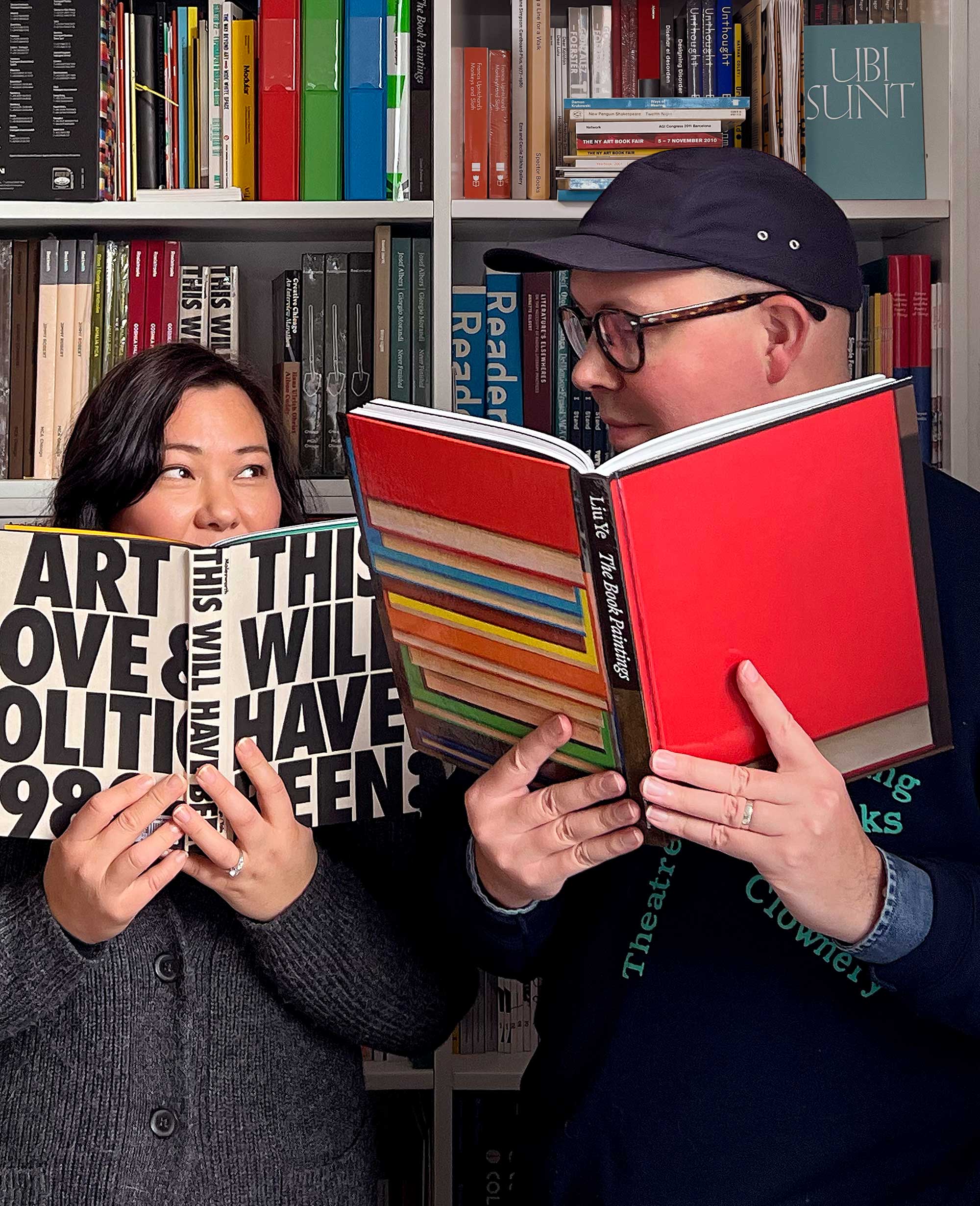
James Goggin and Shan James founded the graphic design studio Practise in London in 1999. Currently based in Tāmaki Makaurau, Aotearoa (Auckland, New Zealand) and Providence, Rhode Island, they are renowned for radically profound and prolific collaborations with global, culture-defining clients. The spaces, experiences, and objects they summon so supernally continue to expand the realms of art, architecture, fashion, music, publishing, gastronomy—and beyond.
In Practise, Chroma finds a ready ally—a trusted cohort of creative enablers with a kindred methodology, rooted in a near-obsession with contemporary culture and a blisteringly tender attention to research, scholarship, theory, and known and untold histories. In our own projects and in our collaborations together, through the magic and medium of design, our studios manifest space in distinct dimensions, with an indelibly cohesive vision.
Alexis Tompkins: James, your and Shan’s work spans graphic design, art and creative direction, editing, and many other methods for identity, print, and digital projects. Even with your work that’s more ephemeral than explicitly corporeal, you’re inevitably creating spaces and spatial experiences, in some ways similar to but also unique from Chroma’s engagement with space. How do you think through concepts of spatiality in your design work broadly, and how does this approach come to inform our work together?
James Goggin: Our name, Practise (British spelling), deliberately plays with the word’s duality as both a noun and a verb, suggesting that a graphic design studio might operate equally as a useful service—a professional practice—and as a space for performing actions of research, speculation, contemplation, and experimentation. A great deal of our work includes contemporary art and design books for major international galleries and institutions, and the conceptual underpinnings of these projects are in many ways inspired by the words of the late Mexican-born, Amsterdam-based artist Ulises Carrión, who wrote in The New Art of Making Books in 1975, that a book is a sequence of spaces, each of which is perceived at a different moment, and therefore also a sequence of moments. In other words, “a book is a space-time sequence.”
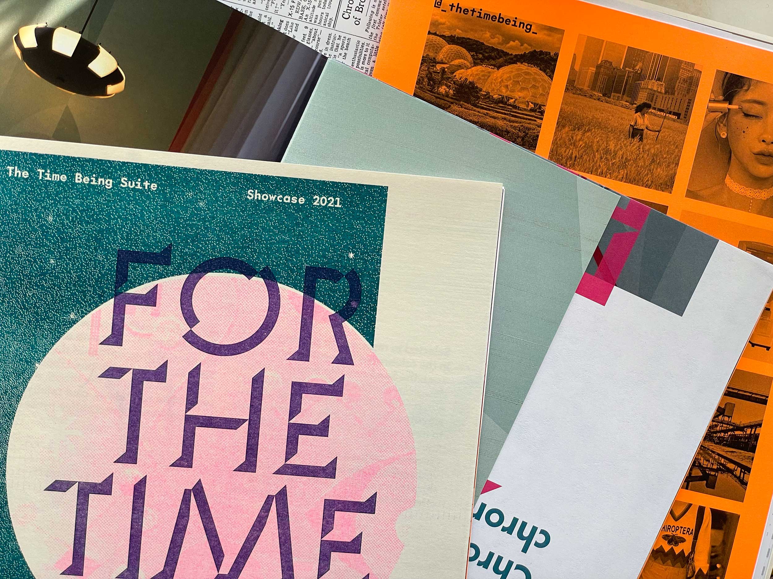
This inherently spatial, and actually interspatial, conception of the book, and how one experiences a book, extends across our design practice as a whole, informing our larger identity, urbanism, and architecture-related projects in which space is much more explicitly literal. Our work with you at Chroma is a great example, in that through our collaborations we have developed sequences in which to, if not physically then psychically and emotionally, explore the spaces that Chroma creates, as well as intuit the moments embodied in those spaces. The zine we created for The Time Being Suite is exemplary in that we not only gave physical form to a project that was compelled to go digital during the pandemic, we manifested the activities, processes, and contexts of its creation—the project’s very essence—through a spatial language we codified in the Chroma identity and continue to iterate.
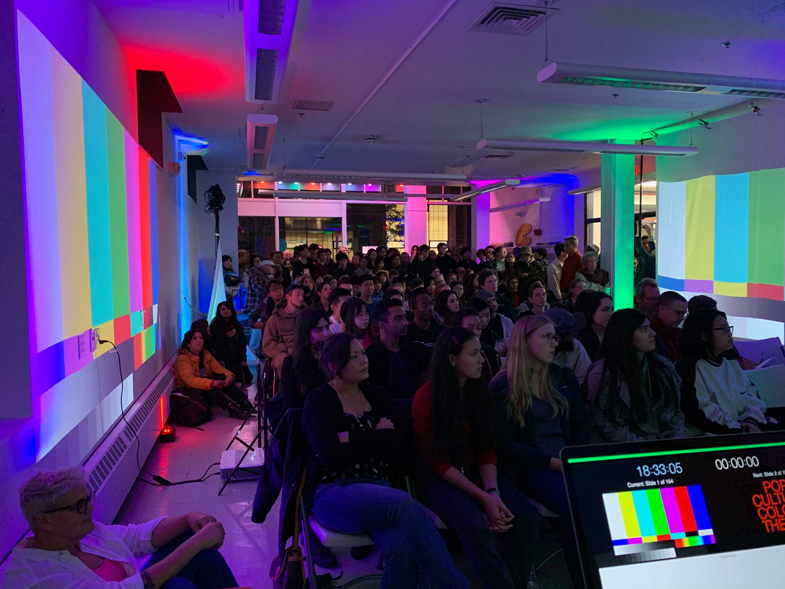
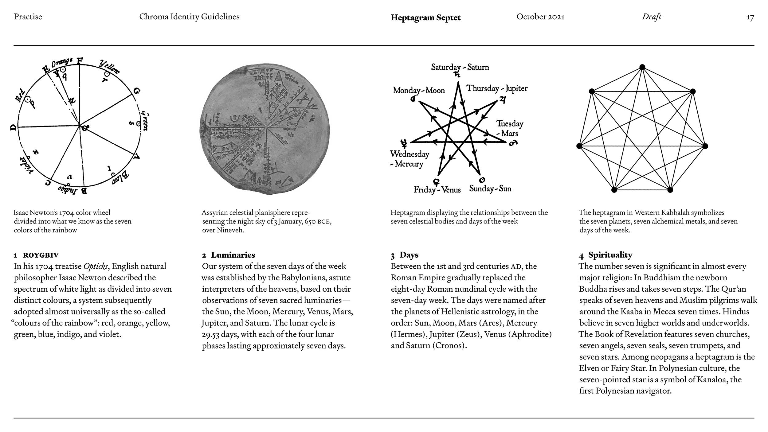
AT: What I’ve found in our collaborations are really artful, deeply personal projects. For many years, [Chroma managing partner] Leann [Conquer] and I would discuss, “what is the Chroma brand?” A lot of interior design firms we surveyed seemed to focus exclusively on the work—and that’s a big part of it certainly—but we were interested in something that more fully encompassed the depths of who we are and what it means to engage with us in our process. Being fans of fashion and other lifestyle brands, we knew that we were really about a feeling, a shared passion, and deep conceptual work. When we first reached out to you about a new identity and we talked through your design philosophy and saw your previous work, I didn’t necessarily see what I wanted—and that’s good, because I wanted to create something I’d never seen before. But I heard what I wanted, in the intelligence and the curiosity and the precision of your approach. And I knew that we would get “there” together.
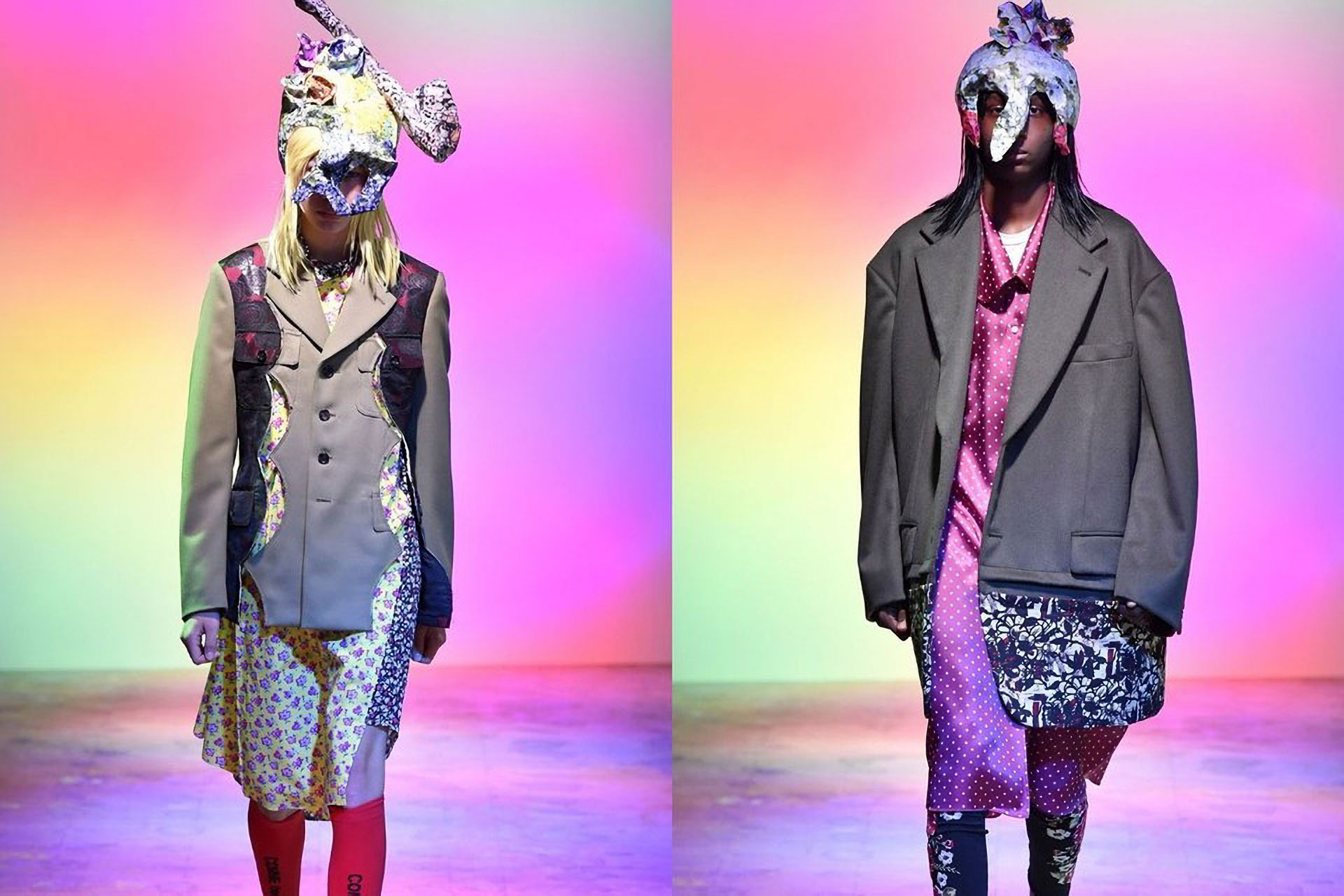
JG: I think we both recognize that we have what I call dialogic practices: our processes are very much based on conversation and collaboration with myriad artists and makers and cultural producers. And as we began developing the Chroma identity, we found a lot of common reference points—Italian architect Carlo Scarpa being an important one, and also Icelandic–Danish artist Olafur Eliasson, Comme des Garçons founder Rei Kawakubo, and so on. There’s been a sort of telepathic kind of synergy. Ultimately the Chroma identity uses a very traditional serif typeface, but on closer inspection it’s incised and consciously digital. There is kind of a brutalist element that’s maybe not overtly evident in Chroma’s aesthetic, but definitely as a common ethic, a reconciliation with materials and history and contemporary culture, and our challenge has been how to make that manifest materially in a series of applications.
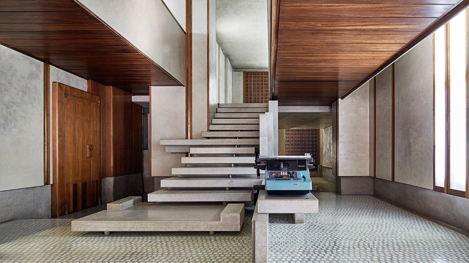
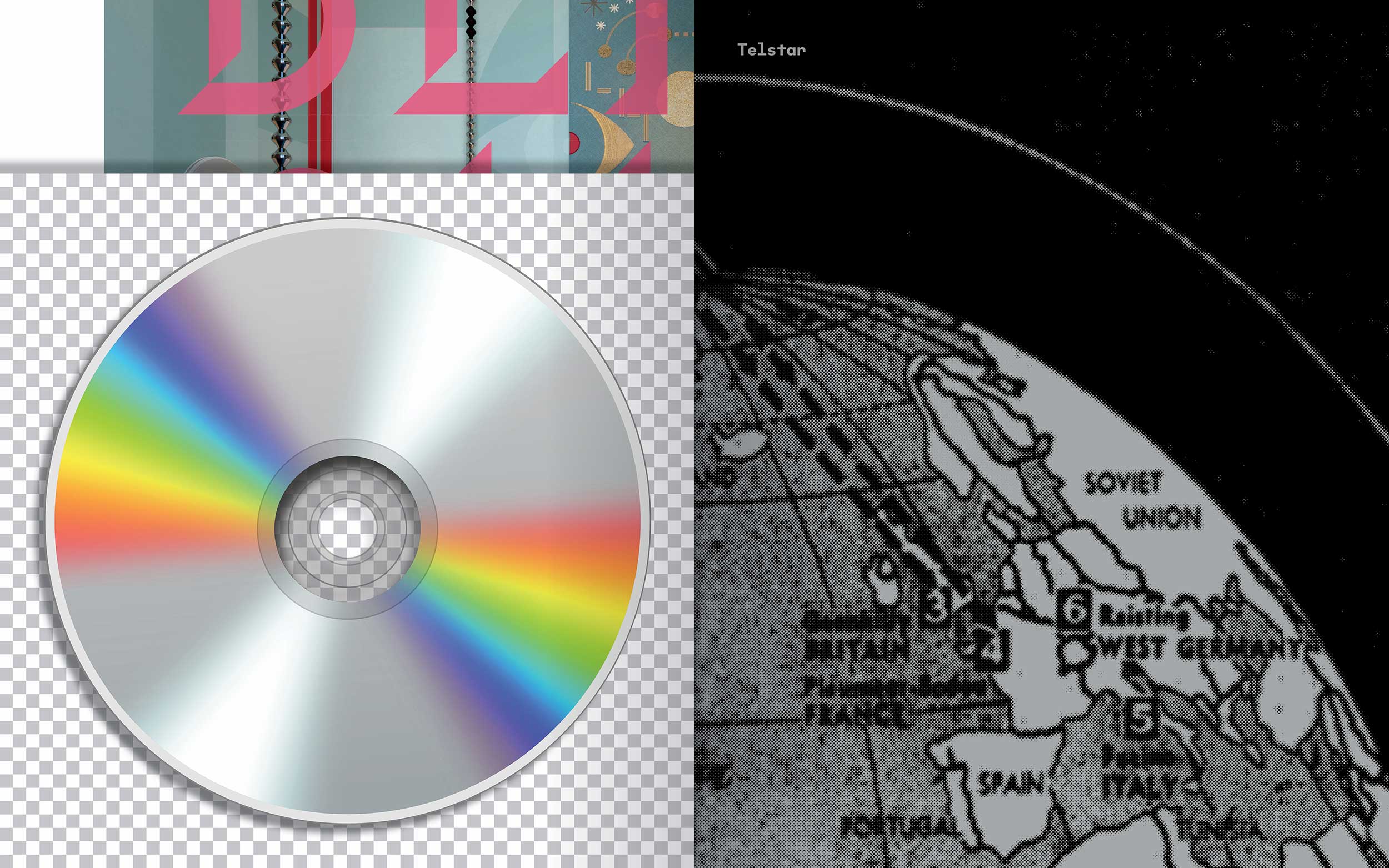
AT: One of my favorite parts of our collaborative process is that almost frenetic volley of references. As designers, of course we share a way of experiencing the world that makes us extra-sensitive to stimuli, but there’s such a lovely nerdy precision inherently to us—we have, for example, collectively effused over the exacting contour of a Brancusi work, the specific palette of a Dries runway collection. Chroma’s work is very physical, obviously, but the way most people will experience it, because we specialize in private residential work, is digital or in print. So our work together has been about how you honor that, how you capture that. For the Time Being Suite, yes, it was ultimately a virtual space because of the pandemic, but it was also conceptually sited in a very real building, a building from the 1960s, which we found out during our discovery phase was completed the same year NASA launched the Telstar 1, a significant part of the early space age that enabled this new era of instant worldwide communication.

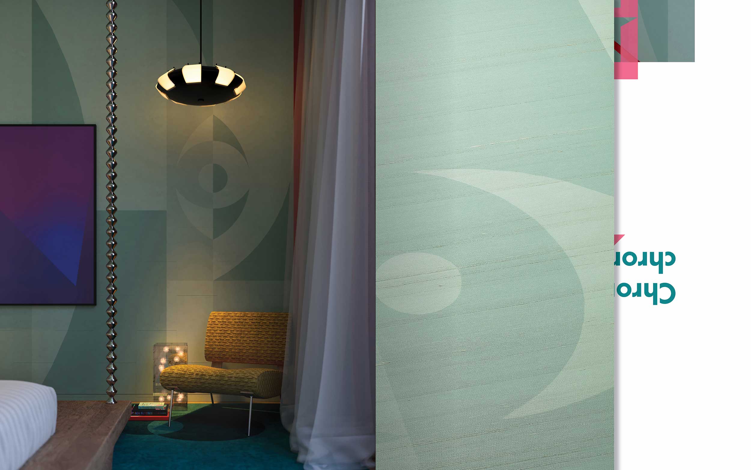
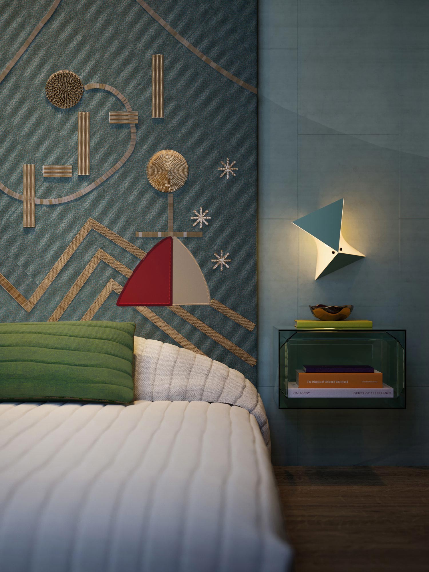
As a studio, we’re continually fascinated by history, historic interiors, of course, but also broader cultural events, cultural happenings. And we’re also obsessed with fashion and film and music and literature, and bringing all these references into our contemporary moment. We had a vision of a room for a teenager that was so uniquely them, a space that evoked every thought and feeling in the horrific yet beautiful process of trying to find themselves in this period of time when they would typically be out in the world experimenting, learning, and finding their voice, but they’re trapped at home and can’t leave for literally fear of their health and their life and safety. So we realized the room as a complete escape, a physical but also psychological space, where they can live out their wildest dreams. It’s an exceptional virtual space. But we also wanted to have something physical come out of it. We ended up creating three tangible “products” from the project: a textile, a wall covering, and, of course, the zine.
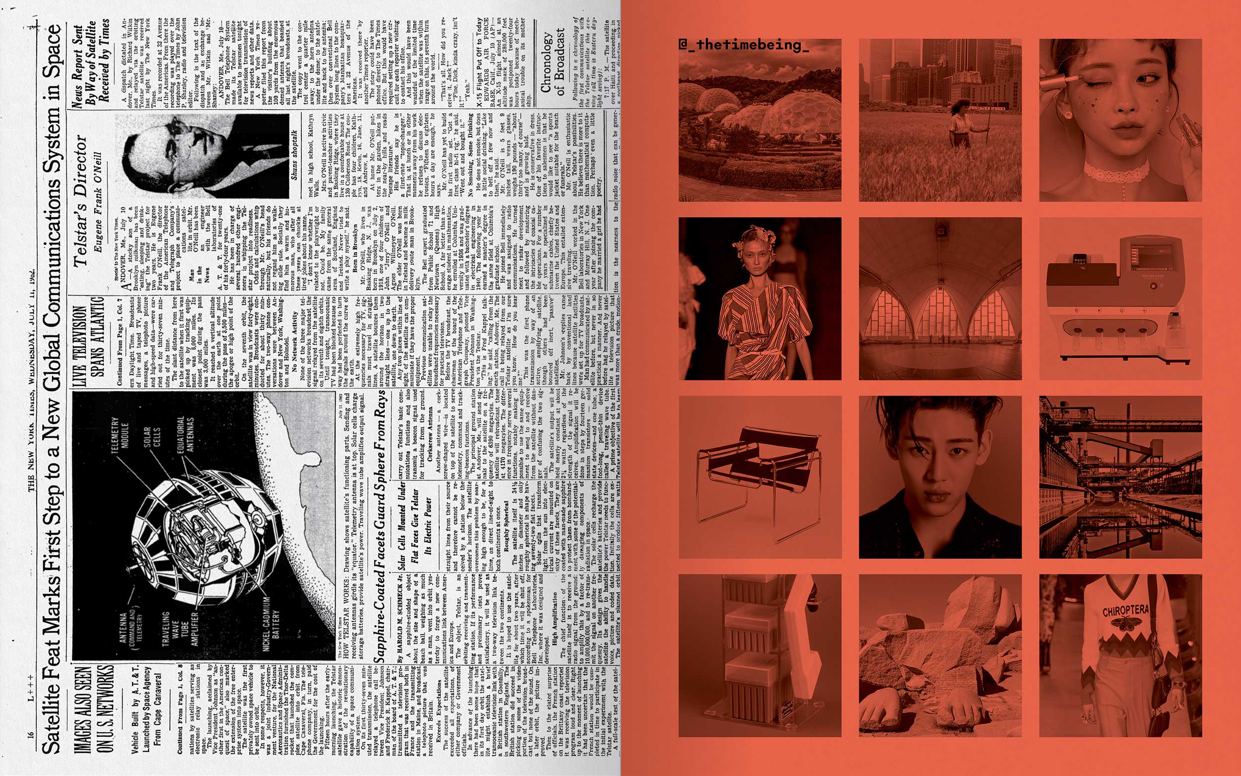
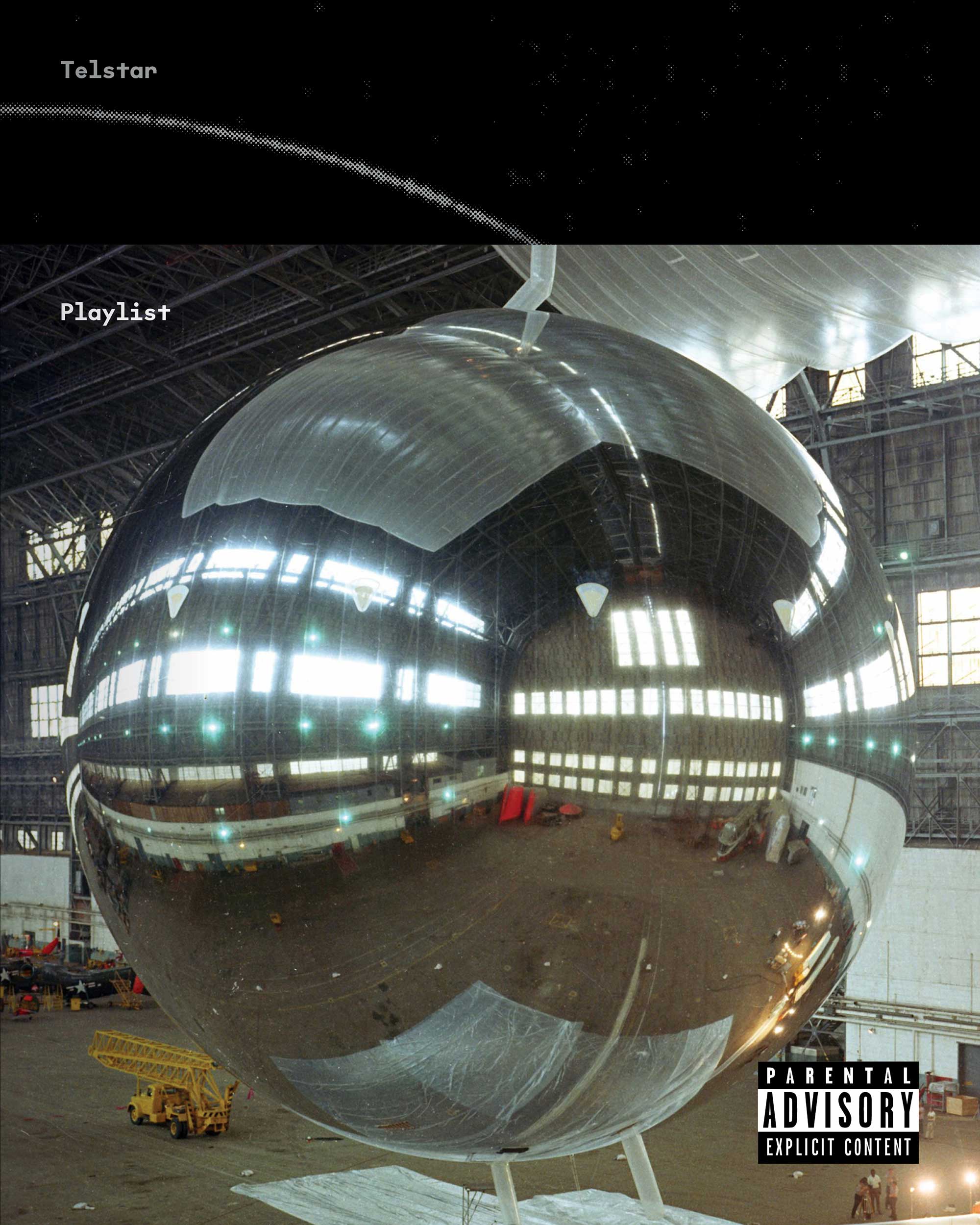
JG: A lot of designers tend to filter their process down into this sleek final result, which I often find to be too finely tuned, leaving out all the messy, really interesting stuff. With the zine, we wanted to expose that process, taking all the different wormholes of your research, all the references and rationales behind the concept, all the different materials you explored and just gather it all up and sort of loosely collate it, using different paper stocks and printing processes—the cover, for instance, is printed Riso, a Japanese stencil printing technique—and all these different methods of communicating this fantastical teenage world. We surveyed real teenagers (OK, our daughters, then in the US, and their friends in London) about their interests, which introduced a lot of new, unusual pairings of references—Agnes Denes, K-beauty, Gucci, even chemistry lab equipment—and tiled all this amazing imagery sort of Instagram-style, which led to setting up an actual Instagram account as yet another platform for engaging with the project. A project-specific playlist was created with Chroma collaborator Ian Mesey, a cool, diverse range of tracks (check it out on Spotify and Apple Music), so we designed a 7-inch record cover for it, parental advisory label included. We pulled historical materials into the project, too, creating this fusion of past and present that ended up coalescing into a sort of future imaginary. It felt a lot like curatorial processes, and I was fascinated by this idea of interior design as exhibition and space as publishing. We all had a lot of fun gathering everything together.
